Time series for monitoring stations and waterbodies
Using the time series functions in the Tarkka service, you can compare satellite observations and field measurements in graph form. The time series tools are located in the Map viewer section. Time series data are available for both coastal and selected lake station locations, as well as for certain coastal and lake waterbodies. In addition, time series are available for the following Habitats Directive marine habitat types: Coastal lagoons (1150), Large shallow inlets and bays (1160), and Boreal Baltic narrow inlets (1650). Time series functionality may be limited on mobile devices.
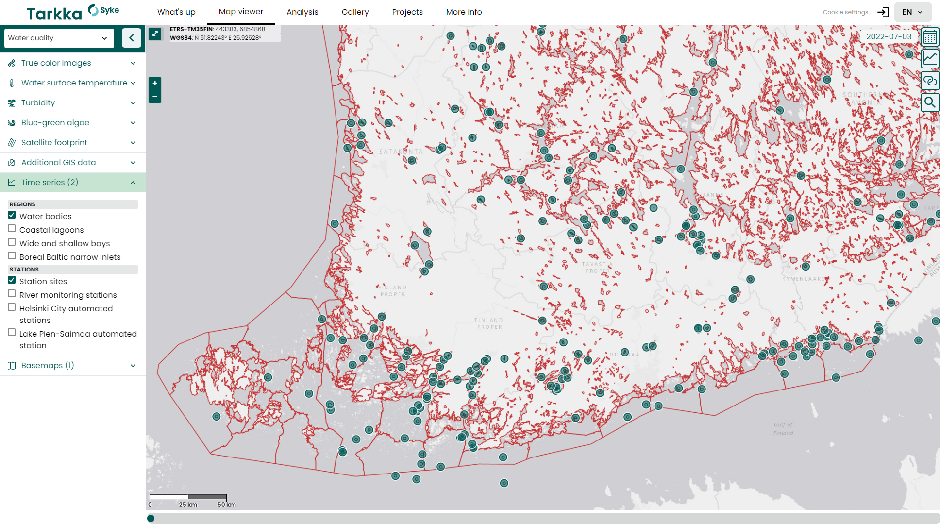
To display time series areas on the map, open the left-side dataset selector in the map view, go to the Time Series section ![]() and activate a dataset from the menu that appears. In the Time series menu, areas covering broader water areas (waterbodies and marine habitats) are listed under Regions, while individual monitoring or observation stations are under Stations. Datasets in the Regions list appear on the map as boundary lines, while datasets in the Stations menu appear as point features. When you add the Station sites dataset to the map, both the station location (the actual observation point) and a circular area around it are displayed. The circular area represents the area covered by the satellite observation.
and activate a dataset from the menu that appears. In the Time series menu, areas covering broader water areas (waterbodies and marine habitats) are listed under Regions, while individual monitoring or observation stations are under Stations. Datasets in the Regions list appear on the map as boundary lines, while datasets in the Stations menu appear as point features. When you add the Station sites dataset to the map, both the station location (the actual observation point) and a circular area around it are displayed. The circular area represents the area covered by the satellite observation.
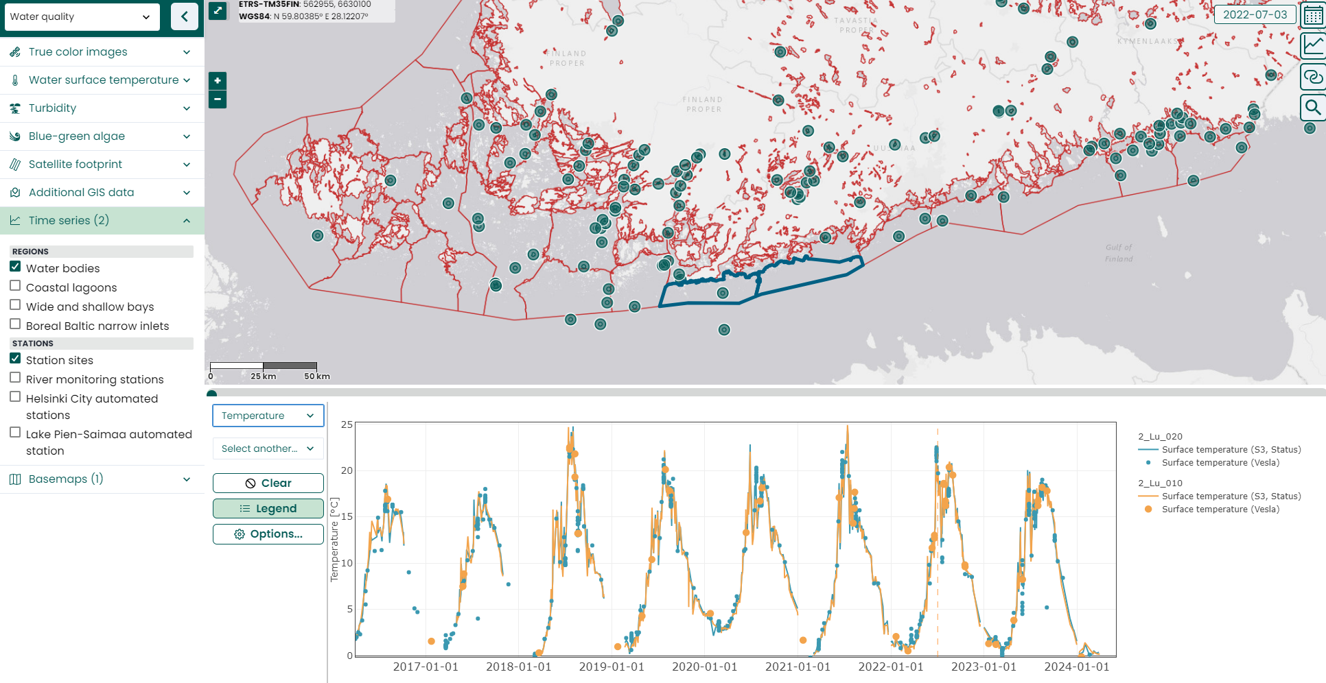
You can open a specific station or area in the time series window by clicking the station or area on the map with the left mouse button. The time series window will open below the map, displaying the selected area’s time series (see image below).
Selecting areas and removing a selection
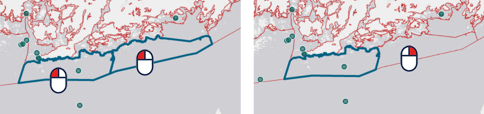
You can select multiple areas by clicking different features with the left mouse button. Selected areas are outlined in dark blue in the map view. The time series for the selected areas automatically update in the time series view.
To remove the selection of a specific area, right-click on that area on the map.
Time series functions
Functions on the left side of the time series view:
Selection of displayed parameters:
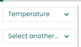
The upper dropdown menu selects the first parameter, whose axis appears on the left side of the graph.
The lower dropdown menu selects the comparison parameter, whose axis appears on the right side of the graph.
 Clear button, removes all selected areas from the map.
 Legend button, which shows or hides the legend on the right side of the graph.
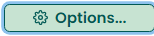 Options button, which provides additional settings:
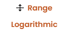
Range: Displays the variation range of observations in the graph. The interquartile range is shown as a thick bar, and the range between the lowest and highest observations is shown as a thinner line.
Logarithmic: Converts the graph’s vertical axes to logarithmic scale.
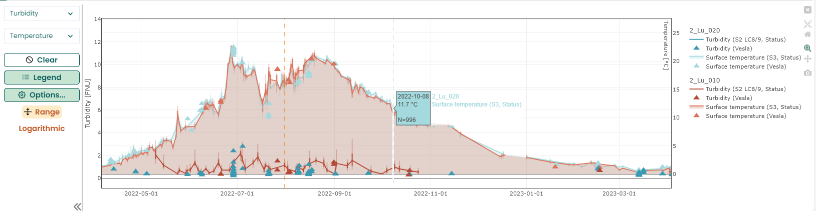
You can display two different parameters at the same time, for example temperature and turbidity. The first parameter is shown on the left axis and the second parameter on the right axis.
When you move the mouse over the graph, additional functions appear on the right side of the time series window. You can focus on a specific time period using the mouse and keyboard as follows:
Zoom in / zoom out
 :
:Click and drag with the left mouse button to select the desired time interval, or
Use the mouse scroll wheel while hovering over the graph: this will zoom in or out the entire view, or
Use the mouse scroll wheel over the horizontal or vertical axis to zoom only that specific axis.
Pan
- Choose the Pan tool from the right side
 , which allows you to grab the time series and move it, or
 - Drag the horizontal axis or either vertical axis while holding down the left mouse button.
- Choose the Pan tool from the right side
Reset to original view
- Double-click the left mouse button, or
- Click the home icon on the right side
 .
.
You can download the graph in png format by clicking the camera icon in the action menu on the right side of the graph ![]() .
.
More detailed information about a specific observation can be obtained by moving the mouse cursor over the desired observation point. This will also highlight on the map the area or target associated with that time series.
By left-clicking an observation in the time series, Tarkka’s calendar date changes to the date of that observation. The map datasets will then update to show the situation at that time. This allows you to investigate, for example, what phenomenon may have caused an unusual time series observation.
You can hide any of the time series shown in the graph by clicking its legend entry (on the right side of the graph) with the left mouse button. Click the legend entry again to make the hidden time series visible once more.
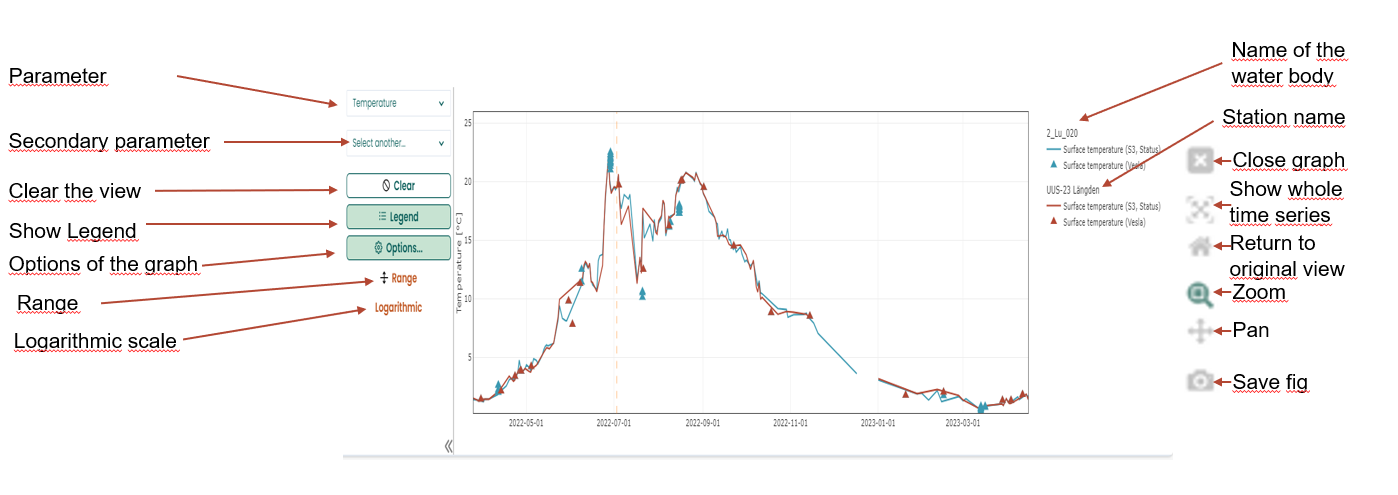
2_Lu_020 and the reference station UUS-23 Längden are zoomed in to the years 2022–2023. Triangle symbols represent field measurements, and the solid lines represent satellite observations.